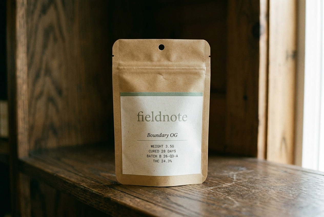
Fieldnote
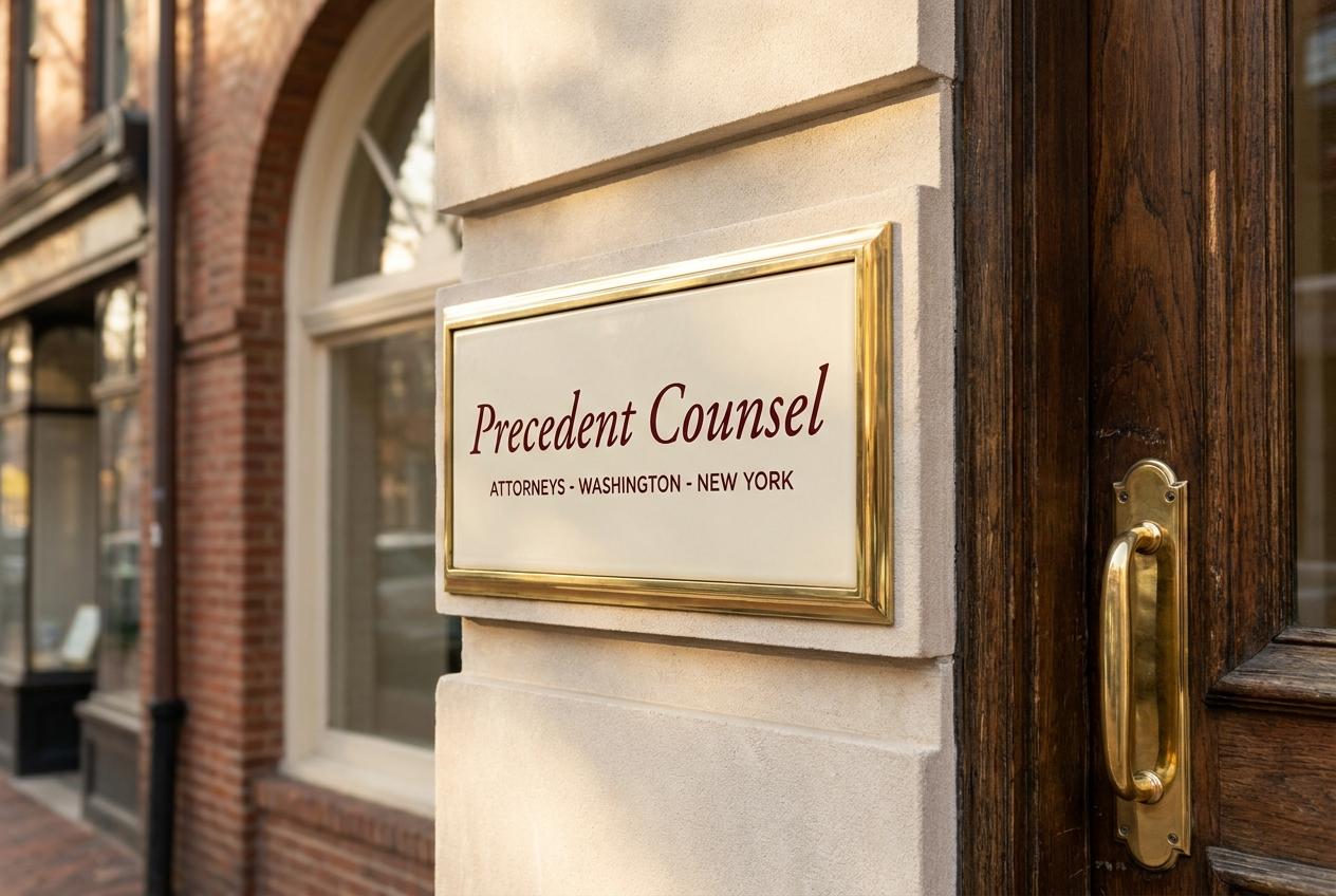
Precedent Counsel
Positioning
A journal-like cannabis brand built around place, season, and hospitality. The cannabis brand a state park gift shop would carry. Paper bone, ink, sage accent — four seasonal rotations a year.
A boutique legal firm for cannabis operators, capital partners, and consequential matters where cannabis-only counsel is not enough.
Audience
Adult-use consumers who buy with intention. The kind of customer who reads field guides on vacation.
Operators, investors, boards, and capital partners who need cannabis fluency with serious legal-sector credibility.
Voice
Journal-like, place-specific, hospitality-focused. Documentary not decorative. Editorial serif headlines + clean sans body + monospace utility.
Precise, restrained, and institutional. The language of briefs, opinions, and partner memos rather than marketing copy.
Style
Paper bone + warm-black ink + sage (cured-cannabis) accent. Four seasonal accent rotations per year (winter pine, spring bud, summer wheat, autumn ember).
Cream cotton, deep ink, oxblood rule, Spectral italic wordmark, formal documents and office architecture.
Avoids
Green-on-black, two accents on one surface, generic startup voice, decorative branding
Cannabis gimmicks, startup law-firm friendliness, generic gavel imagery, faces as hero surfaces, glossy corporate gradients
Market
Minnesota, Multi-state US
Washington DC, Multi-state US
Category
Flower, Pre-rolls, Edibles, Concentrates
Legal services
Model
Brand only, DTC
Professional services, B2B / Wholesale
Aesthetic
Seasonal / journal, Editorial
Formal, Archival / scientific