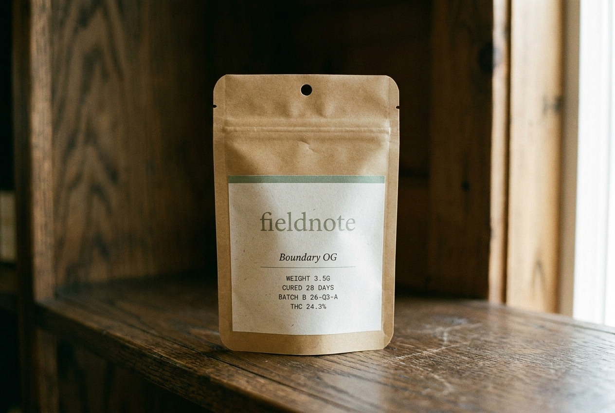
Fieldnote
Materia
Positioning
A journal-like cannabis brand built around place, season, and hospitality. The cannabis brand a state park gift shop would carry. Paper bone, ink, sage accent — four seasonal rotations a year.
An integrative medical practice for patients considering cannabis as therapy, with structured care plans, condition programs, and physician-grade restraint.
Audience
Adult-use consumers who buy with intention. The kind of customer who reads field guides on vacation.
Patients, caregivers, and referring physicians who need cannabis considered inside a real care plan, not sold as lifestyle.
Voice
Journal-like, place-specific, hospitality-focused. Documentary not decorative. Editorial serif headlines + clean sans body + monospace utility.
Clinical, careful, and plain. The brand should sound like a physician referral and a care-plan note, not a dispensary menu.
Style
Paper bone + warm-black ink + sage (cured-cannabis) accent. Four seasonal accent rotations per year (winter pine, spring bud, summer wheat, autumn ember).
Clinical white, deep teal ink, muted teal, soft amber safety callouts, Crimson Pro editorial medical tone.
Avoids
Green-on-black, two accents on one surface, generic startup voice, decorative branding
Wellness influencer language, recreational retail energy, miracle claims, psychedelic gradients, vague medical authority
Market
Minnesota, Multi-state US
California, Multi-state US
Category
Flower, Pre-rolls, Edibles, Concentrates
Medical care
Model
Brand only, DTC
Medical clinic, Professional services
Aesthetic
Seasonal / journal, Editorial
Clinical, Editorial