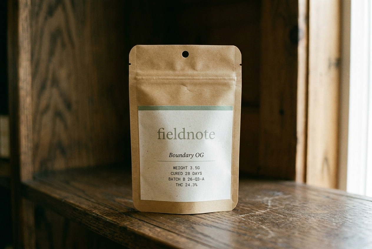
Fieldnote
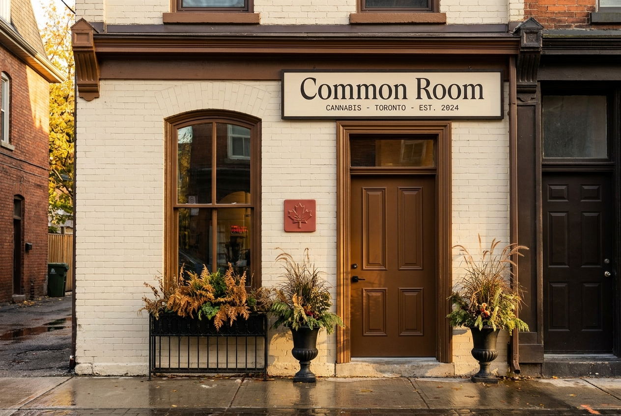
Common Room
Positioning
A journal-like cannabis brand built around place, season, and hospitality. The cannabis brand a state park gift shop would carry. Paper bone, ink, sage accent — four seasonal rotations a year.
A warm Toronto cannabis room with craft cultivators, knowledgeable staff, and a retail rhythm built around relationship, not checkout speed.
Audience
Adult-use consumers who buy with intention. The kind of customer who reads field guides on vacation.
Toronto residents who treat a wine merchant, bookstore, or specialty retailer as part of their weekly rhythm.
Voice
Journal-like, place-specific, hospitality-focused. Documentary not decorative. Editorial serif headlines + clean sans body + monospace utility.
Warm, specific, and never pushy. Specialty wine merchant newsletter meets staff-pick shelf-talker meets polite hotel concierge note.
Style
Paper bone + warm-black ink + sage (cured-cannabis) accent. Four seasonal accent rotations per year (winter pine, spring bud, summer wheat, autumn ember).
Oat cream, deep ink, maple brown, soft red accent, Cormorant editorial type, cream cotton print artifacts.
Avoids
Green-on-black, two accents on one surface, generic startup voice, decorative branding
Discount cannabis retail, fluorescent chain-store energy, transaction-time optimization, glossy premium minimalism
Market
Minnesota, Multi-state US
Canada
Category
Flower, Pre-rolls, Edibles, Concentrates
Retail, Flower, Concentrates, Pre-rolls
Model
Brand only, DTC
Dispensary
Aesthetic
Seasonal / journal, Editorial
Intimate / hospitality, Heritage, Premium retail