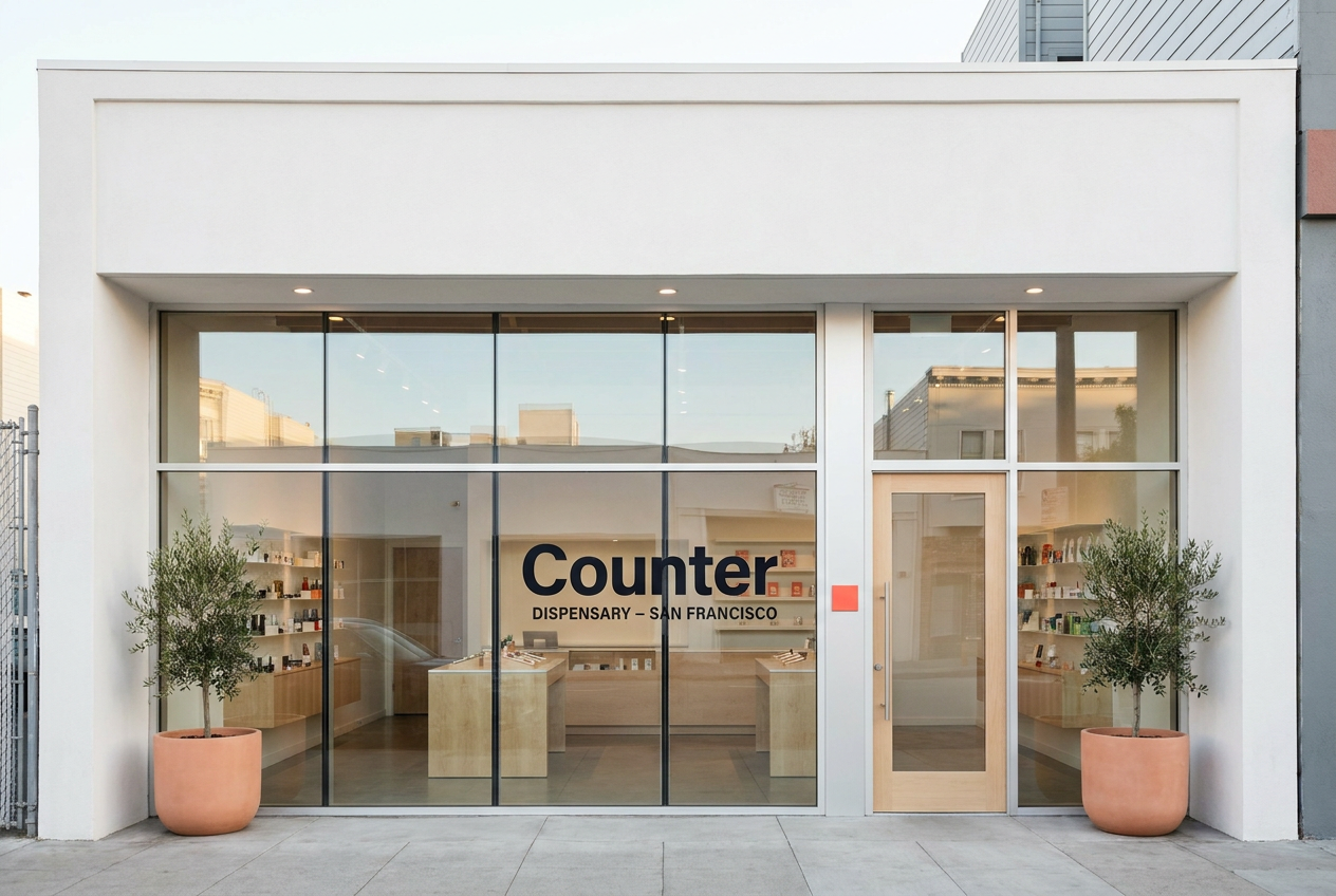
Counter
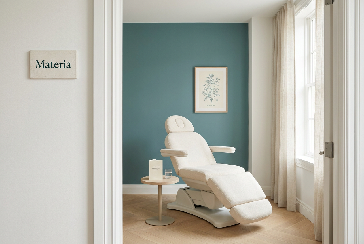
Materia
Positioning
A private-label San Francisco dispensary chain using the modern flagship retail playbook: glass, light wood, iPads, no cash wrap.
An integrative medical practice for patients considering cannabis as therapy, with structured care plans, condition programs, and physician-grade restraint.
Audience
Premium San Francisco buyers who already shop Apple, Aesop, Mejuri, Sweetgreen, and expect cannabis retail to match the rest of their week.
Patients, caregivers, and referring physicians who need cannabis considered inside a real care plan, not sold as lifestyle.
Voice
Quiet, premium, modernist, and product-led. Short retail-system copy, not lifestyle cannabis copy.
Clinical, careful, and plain. The brand should sound like a physician referral and a care-plan note, not a dispensary menu.
Style
Clean white surface, deep ink, electric coral accent, maple architecture, Manrope display type, product edition grammar.
Clinical white, deep teal ink, muted teal, soft amber safety callouts, Crimson Pro editorial medical tone.
Avoids
Legacy glass-case dispensary format, cash-wrap checkout, third-party shelf chaos, streetwear cannabis cues
Wellness influencer language, recreational retail energy, miracle claims, psychedelic gradients, vague medical authority
Market
California
California, Multi-state US
Category
Retail, Flower, Concentrates, Pre-rolls, Edibles
Medical care
Model
Dispensary, Retail chain, DTC
Medical clinic, Professional services
Aesthetic
Premium retail, Editorial
Clinical, Editorial