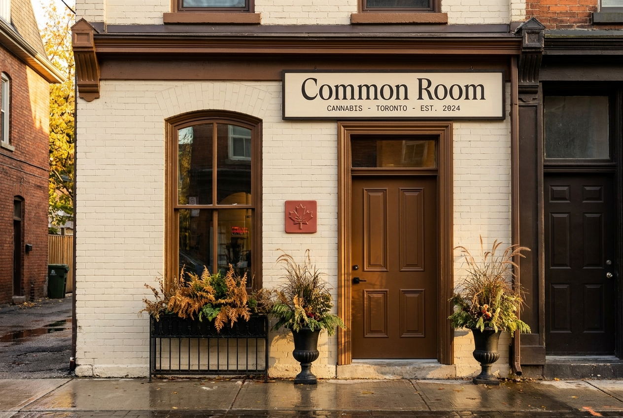
Common Room
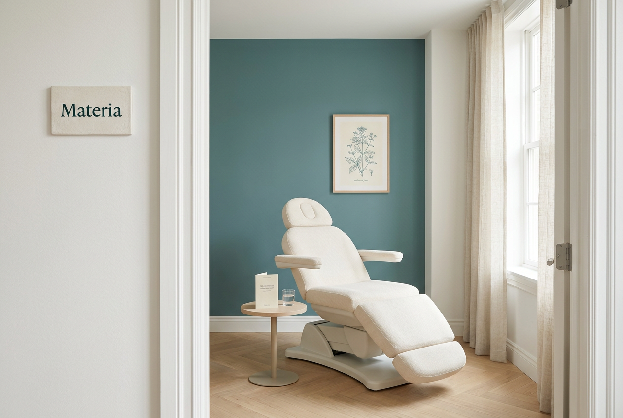
Materia
Positioning
A warm Toronto cannabis room with craft cultivators, knowledgeable staff, and a retail rhythm built around relationship, not checkout speed.
An integrative medical practice for patients considering cannabis as therapy, with structured care plans, condition programs, and physician-grade restraint.
Audience
Toronto residents who treat a wine merchant, bookstore, or specialty retailer as part of their weekly rhythm.
Patients, caregivers, and referring physicians who need cannabis considered inside a real care plan, not sold as lifestyle.
Voice
Warm, specific, and never pushy. Specialty wine merchant newsletter meets staff-pick shelf-talker meets polite hotel concierge note.
Clinical, careful, and plain. The brand should sound like a physician referral and a care-plan note, not a dispensary menu.
Style
Oat cream, deep ink, maple brown, soft red accent, Cormorant editorial type, cream cotton print artifacts.
Clinical white, deep teal ink, muted teal, soft amber safety callouts, Crimson Pro editorial medical tone.
Avoids
Discount cannabis retail, fluorescent chain-store energy, transaction-time optimization, glossy premium minimalism
Wellness influencer language, recreational retail energy, miracle claims, psychedelic gradients, vague medical authority
Market
Canada
California, Multi-state US
Category
Retail, Flower, Concentrates, Pre-rolls
Medical care
Model
Dispensary
Medical clinic, Professional services
Aesthetic
Intimate / hospitality, Heritage, Premium retail
Clinical, Editorial